ProfEnergie — a web presence and internal order management for an energy consultancy
An independent energy consultant in Freiburg arranges electricity, gas and heating tariffs — competing with comparison portals while doing it. So the site does not lead with a tariff calculator but with the person behind it: ten years of career as a timeline, 31 provider entries as evidence, four steps as a promise. Behind the login sits the order management that turns an enquiry into a processed case.
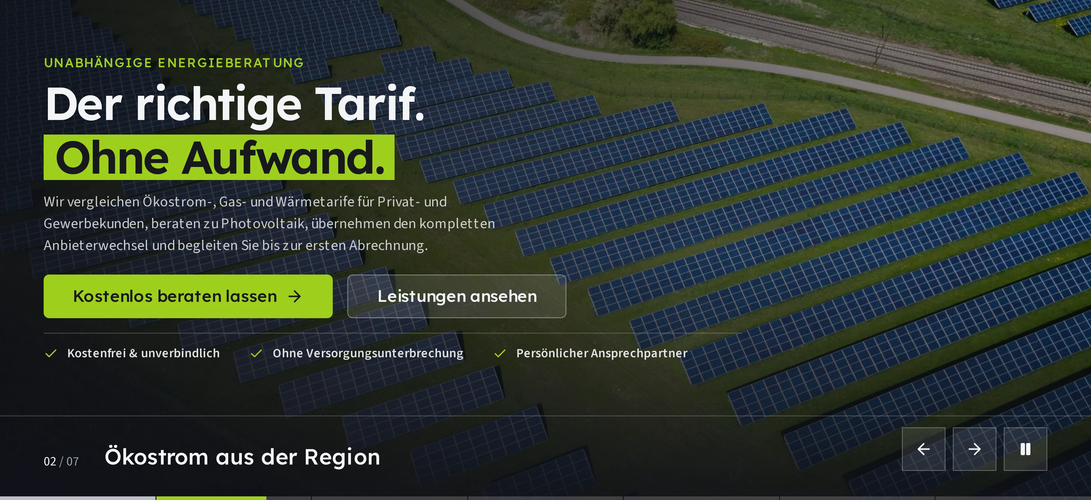
Live website
profenergie.de


A client project, live to check: profenergie.de is the web presence of Erdal Gücün, an independent sales partner of TeleSon Vertriebs GmbH. Everything described here can be checked on the site itself — except the protected internal area. There is, for good reason, no screenshot of it with real data.
Starting point
Anyone wanting to switch electricity supplier today lands on a comparison portal first: a calculator, a list, a sign-up bonus — and twelve months later the same game again. An independent adviser offers something a portal cannot: a person who still knows the contract after it is signed and who cancels the old one for you. That was exactly what could not be seen online. Ten years of career, thousands of contracts arranged and one named contact instead of a hotline — all of it lived in phone calls, not on a page you find before the first call.
Then there is the other half of the work, which nobody sees from outside. An enquiry becomes an order that has to be recorded, assigned and reported on. A web presence that only generates enquiries and then stops would have left that half untouched — moving the bottleneck rather than removing it.
The challenge
- Trust without a calculator: in the first seconds the site has to explain why a person beats a comparison portal — without rebuilding the comparison portal.
- Two audiences, one presence: private and business customers are looking for a tariff, prospective sales partners for a business opportunity. Both have to find themselves without the site splitting into two sites.
- Showing third-party brands properly: 17 providers for households and 14 for business are part of the evidence. Naming them is allowed — clearing the usage rights for every single logo would have been a project of its own.
- It does not end at the click: the public part and the internal part had to belong together — one login, one codebase, one deployment instead of two systems side by side.
The solution
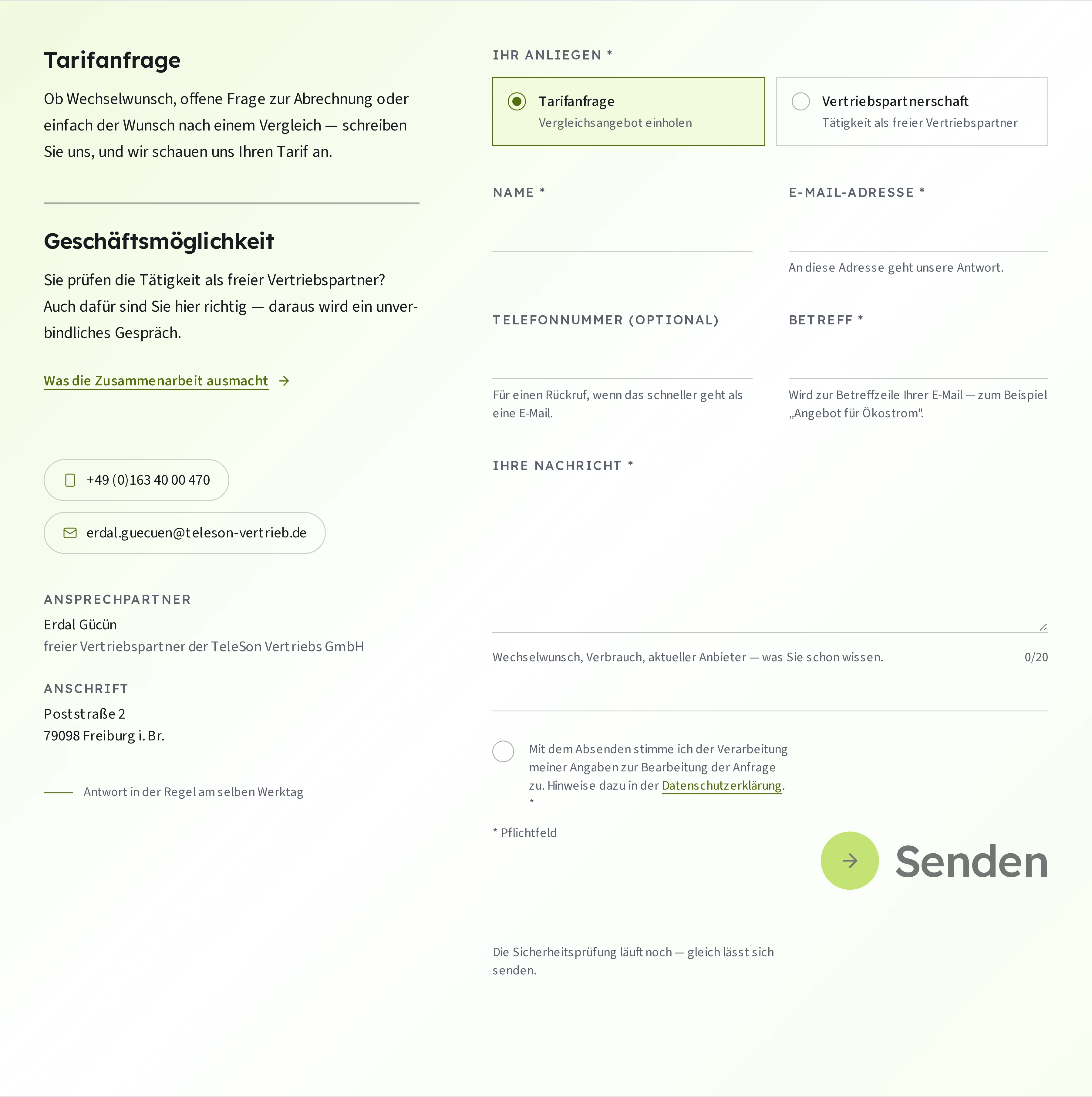
The home page does not lead with a tariff calculator but with the career: seven stations from December 2015 to today, as a timeline that builds up station by station as you scroll. Experience is not claimed there, it is counted out. After that the providers run past as two moving bands, the six service areas stand side by side as equals, and the process is cut down to four steps that come into view one at a time while scrolling: send the bill, have it compared, place the order, start being supplied. The order is that of a conversation, not of a product catalogue.
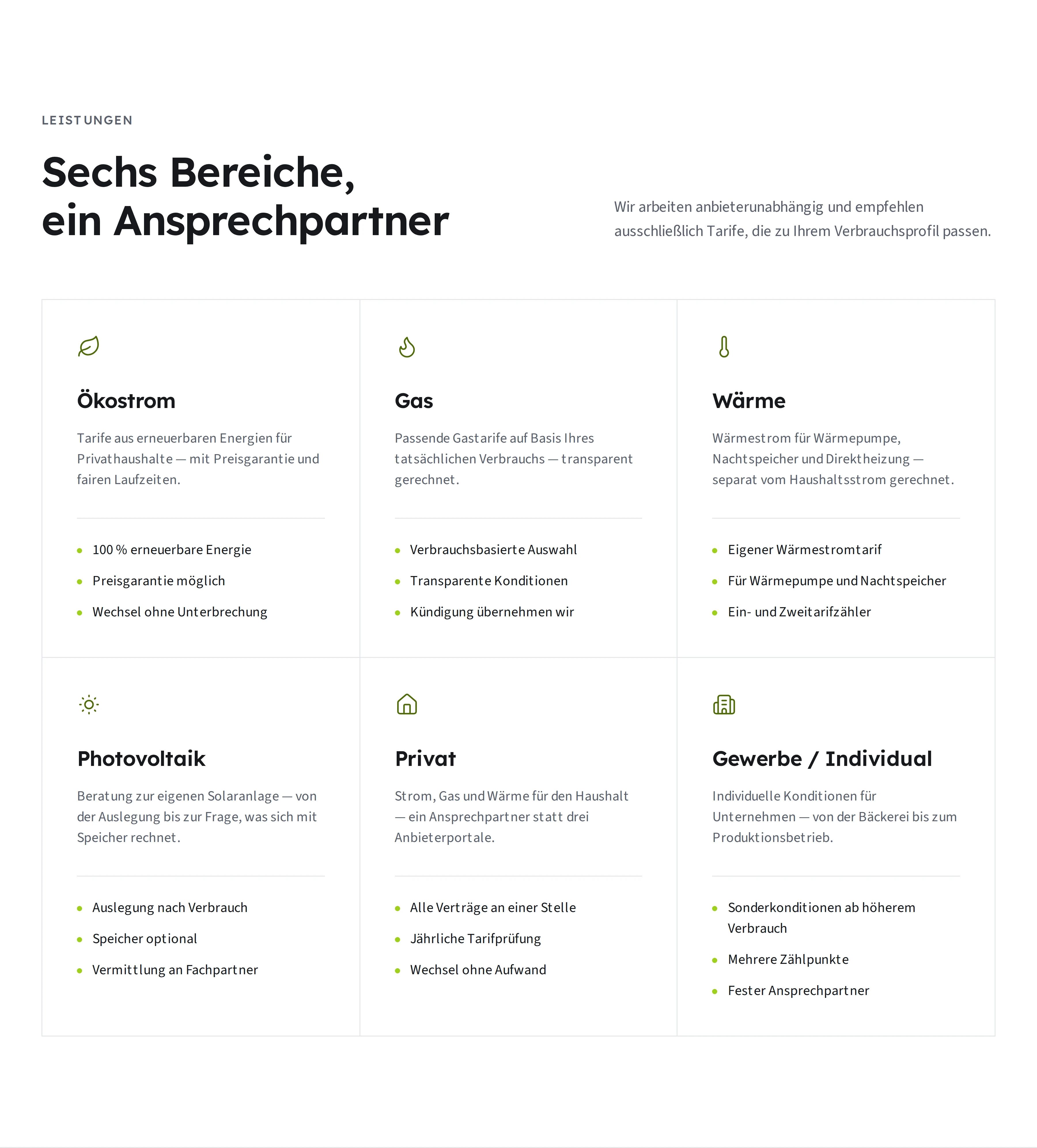
Two moving bands instead of third-party logos
The providers are the site's strongest evidence and at the same time its most delicate part: they are other people's brands. The answer is type instead of image — every name is set as text with a note on whether electricity, gas or heat is arranged there. That avoids the licensing question for each individual logo, stays sharp on every screen, costs not a single image request and can be read out by a screen reader. Two bands run in opposite directions, split into private and business, with the count beside them: 17 and 14. Above them sits a “pause the band” button — motion you cannot stop is not design for some people, it is an obstacle.
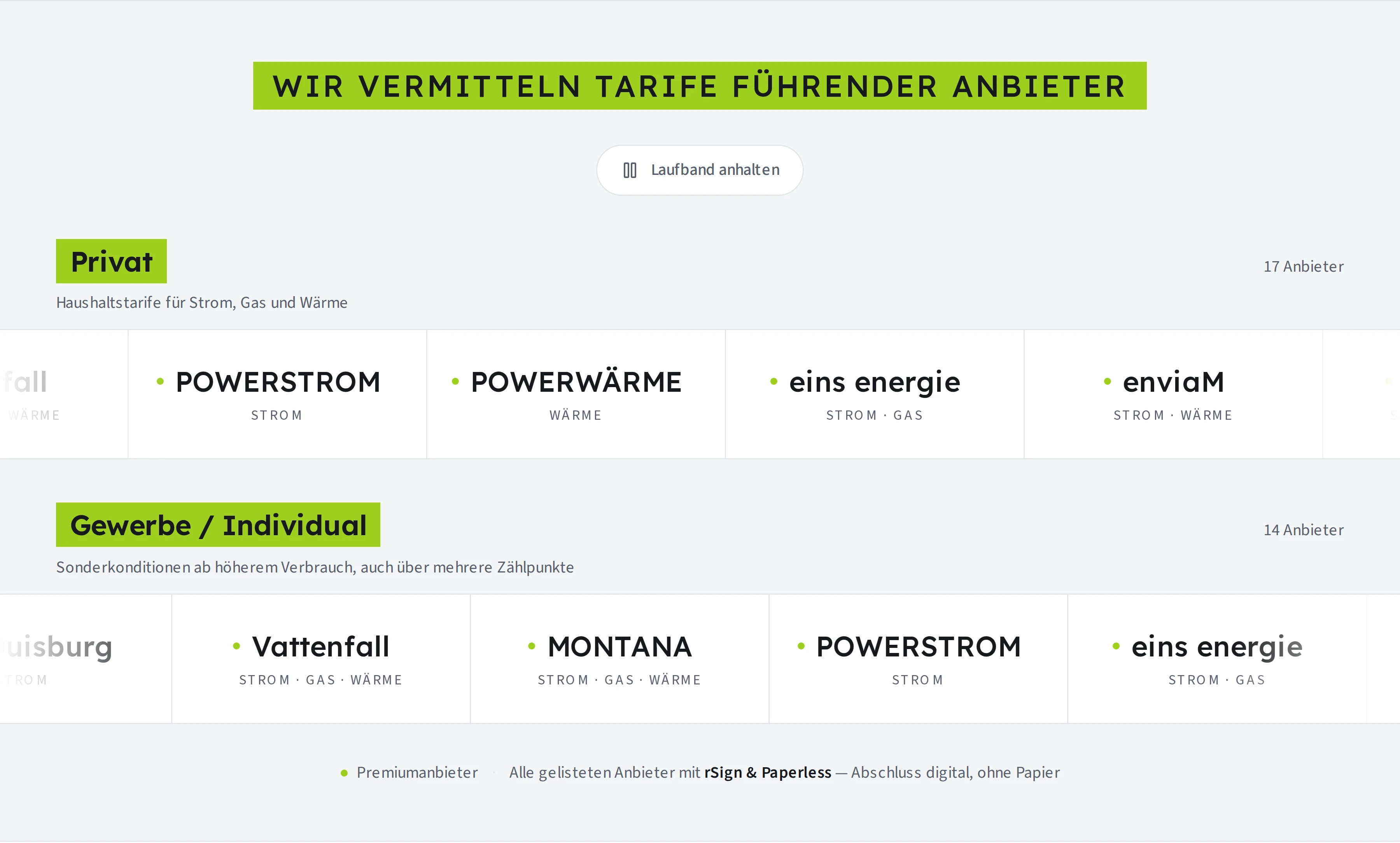
Two intentions, one form
The second audience could easily have become a second website. Instead the first click in the contact form decides: “tariff enquiry” or “sales partnership”. The fields stay the same, the hints below them change, and the message arrives in the inbox with a matching subject line. The sales side additionally gets a page of its own with two videos — which are only loaded from Vimeo after an explicit click. Before that, not a byte leaves the domain. Cloudflare Turnstile guards against automated submissions, working without a cookie and without a cross-site profile.
The part behind the login
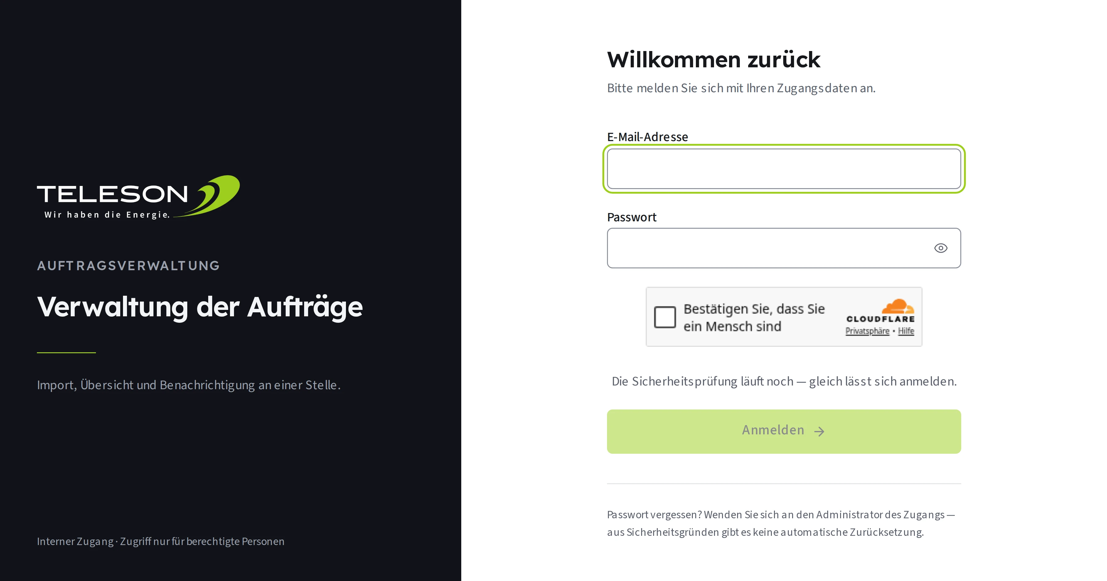
Under the same domain, from the same codebase and on the same design grid sits the order management: import, overview and notification in one place. It is not a second product but the continuation of the form — what comes in at the front becomes a case at the back. Access is correspondingly tight: every call below /dashboard is redirected to the login, search engines are excluded via robots.txt, the same check stands in front of the login button as in front of the contact form, and there is deliberately no automatic password reset — a self-service reset path is more attack surface than convenience when there is a single authorised account.
Technology that does not draw attention
The site is pre-rendered and served from a network of delivery nodes; the images live as WebP in a dedicated store and are handed over as AVIF in the right size depending on the browser. The opening image has a portrait crop of its own for narrow screens, not merely a scaled-down version — of seven motifs exactly one is loaded immediately, the other six only when their turn comes. Nothing shifts while loading: the height and width of every image are fixed in advance.
- No cookies, no tracking pixels, no consent banner: opening the home page contacts not a single third-party server.
- The image sequence and the moving bands can be paused, every section carries a heading a screen reader can announce, and anyone who has asked for reduced motion gets it.
- The fonts ship with the page instead of being fetched afterwards — no reflow jump once they arrive.
- The legal pages are complete: an imprint, a privacy notice under Art. 13 GDPR and a postal address on every page.
Measured
The following values come from a measurement of the home page with Chromium, without artificial throttling — they show what the setup allows, not what a particular connection makes of it.
- 0,9 sto the large opening image at a desk, 1.8 s on a phone
- 0layout shifts while loading (CLS)
- 0cookies, trackers and consent banners
- 7 + 1public pages plus a protected internal area
What this means for your sales
The business core of this setup is not the technology but the order in which the evidence arrives. Somebody being advised compares not only prices but people — and needs something checkable for that: a career with dates, a provider list with a count, a process with four steps rather than twelve. Whoever does the arranging then needs a place where the order does not turn back into manual work. Keeping both in one system saves more than licences: it keeps the path from enquiry to case short enough for one person to walk it alone.
A similar project in mind?
Tell me what you need – the first conversation is free.
Get in touch